Designing a booking experience
A way for consumers to book a session with their coach.

The client
NWOW is a subsidiary company of my current employer Inovirtue. NWOW offers businesses personalized development and engagement strategies for employee growth. The product is a web app that provides Coaches and their Clients the ability to book and conduct online video sessions.

The challenge
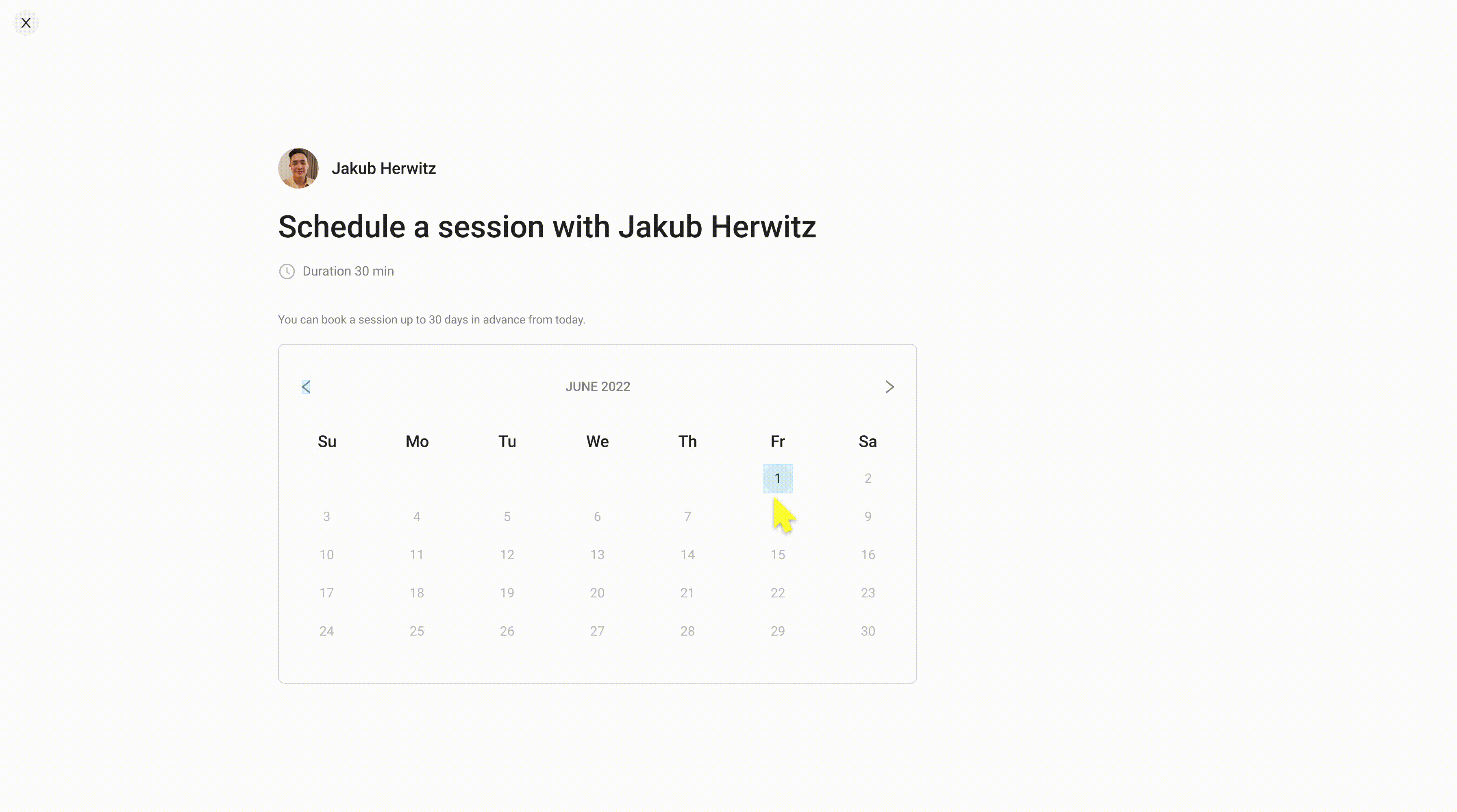
To design a way for Consumers to book a session with a Coach. Also, to explain the booking rules, which allows the Consumer to book a session up to 30 days in advance.
Team
UX Designer x 2
Head of UX
Timeline
May 2022
alongside other projects
Responsibilities
I was solely responsible for the ideation and the design phases, which consisted of creating user flows, designing the content, and prototyping and the final user interface designs.
Whilst working with my UX designer colleague to plan, organise and conduct moderated user testing sessions.
User task flow
Booking a session happy path

Ideation
Setting out the solutions.
Booking page
Where the user can select a date and time and provide information about how far in advance they can book.
Confirm page
Where the user can have a final overview of the date and time before confirming the booking.
Success page
To inform the user that the session has been booked.
The UI design
The design phase consisted of designing mid-fidelity wireframes to conceptualize the layouts, the user flow and features. I designed the UI for the main pages and subpages.
Components
This is a sample of components used in the designs. The components are saved in a custom component library that my colleagues and I design and manage. The components are used on multiple products.
Atoms
Molecules
Organism

Confirm booking page
.png)
Sample of the designs
Usability Testing & Findings
We created a test plan and script and conducted unmoderated sessions.
The goal was to assess the learnability and usability for new users, on mobile and desktop devices. We set them three tasks which was to book a new session, join a session and book a session for the next period.
The prototypes
Click on an image to view the prototype.
.png)
.png)
Findings
The participants were able to complete all of the tasks, understood the booking rules, and gave mostly positive feedback, which was supported by the high SUS (system usability scale) score of 92.5 and the high rating score of 6 or higher for easy-to-complete.
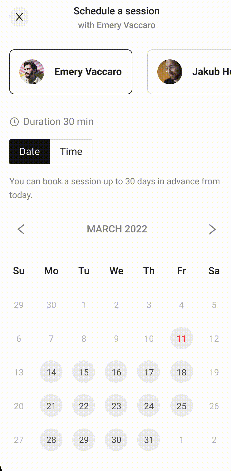
On the booking screen, after selecting a date some of the users did not notice that the time options had appeared below the calendar.
Design improvements
The time option results were not obvious to the users.
Improvements
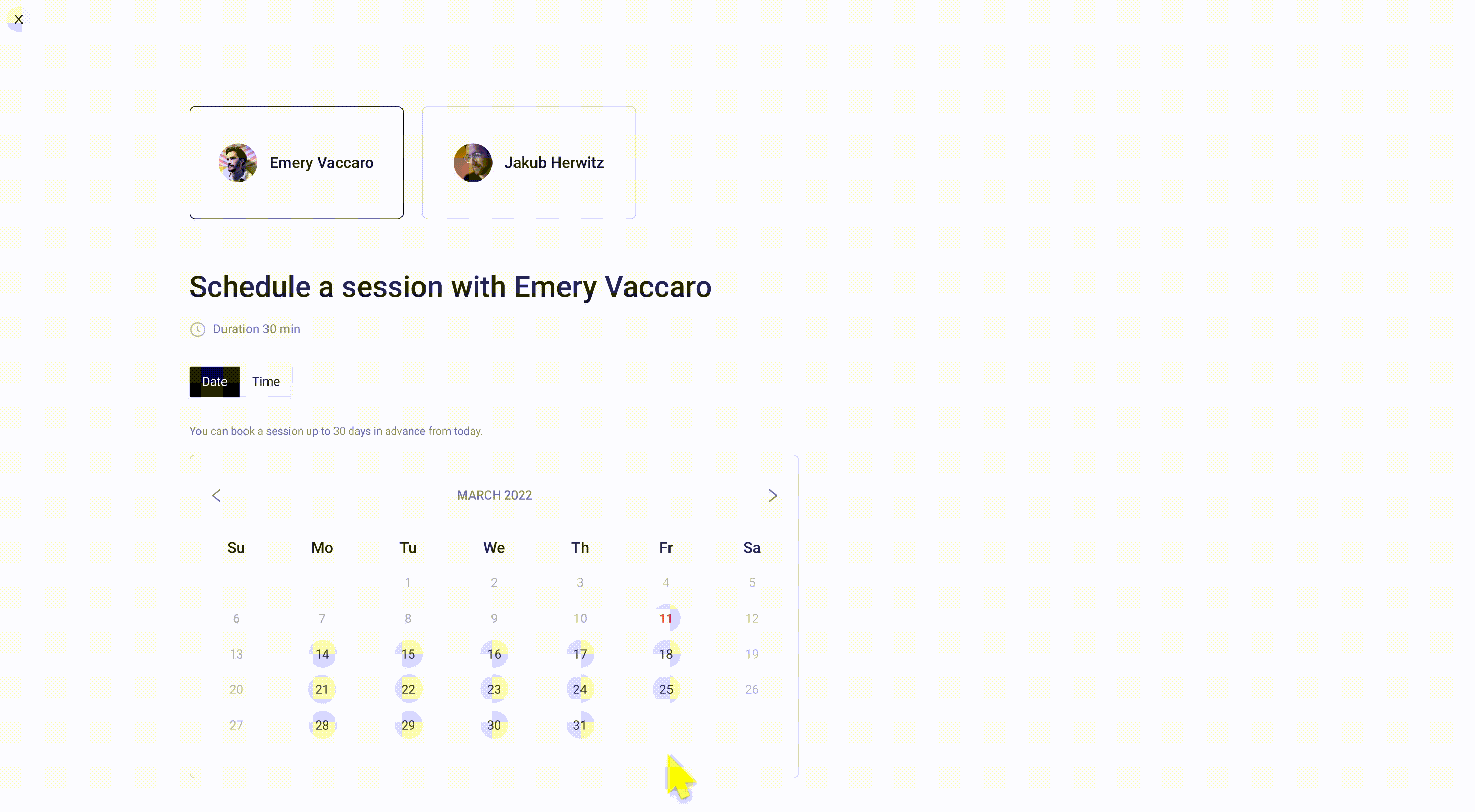
To clearly differentiate between the time and date sections we opted for a tab selection to clearly separate the date and time. Selecting the date automatically takes the user to the time options, but they can also return to the dates options.
This also works better for the mobile, as the user can select between both, rather than navigating to the previous page.
The final design
I presented the designs to the developers and they have been built. In hindsight, it would have been beneficial to conduct user research before ideation, however, due to budget and time restraints, this was not possible. Alternatively, I conducted thorough competitor research. The next step would be to gather analytics and conduct further user testing with customers.
.png)


